MRV Manancial
UI/UX and creative direction of the launch campaign
- My role
- Creative Director
- Year
- 2024
 MRV Manancial
Context
Manancial da Fé is a club-style residential development launched by VIC Engenharia, a builder operating in 5 states and the Federal District. Target audience: families looking for their first home, sensitive to payment terms and to the sense of security an established builder's name conveys.
- Client
- VIC Engenharia
- Year
- 2024
- Category
- Real Estate
- Role
- Creative Director
Challenge
The launch of a new VIC Engenharia development needed its own page that could sell the dream of home ownership while qualifying leads before they reached a consultant: units, floor areas and terms vary by tower and construction phase, and a generic institutional site couldn't handle that complexity.
The website, section by section
The launch landing page, from the emotion at the top to the builder's proof.
- 01 / 06
The top
The family in the foreground, the development's facade and the line "A home built on the foundations of family tradition". Right below, what drives the purchase: discounts of up to R$55,000, down payment in up to 60 installments and the Minha Casa Minha Vida seal.
- 02 / 06
Talk to a consultant
The form comes right in the second section, with just three fields (name, email and WhatsApp) and contact consent. Beside it, a family video reinforces the dream of home ownership.
- 03 / 06
The apartments
Floor areas from 43.78 m² to 50.88 m², 2 bedrooms with a garden option and premium finishes shown as icons. The technical data only appears after the emotion.
- 04 / 06
Leisure
"Under the Sun, there's time to rest": pool, gourmet area, sports court, playground, fitness, pet place and bike rack, with renderings of the condo in a carousel.
- 05 / 06
The location
An illustrated map of the surroundings and a list of what's nearby (schools, supermarkets, pharmacies, urgent care, access to Via Light and Via Dutra), with real everyday photos.
- 06 / 06
Model unit and builder
The invitation to visit the model unit, with the address and a button to schedule, and VIC Engenharia's proof: 5 states and the Federal District, 65+ cities and more than 25,000 people living in a VIC home.
Solution
A launch landing page with its own creative direction for the development: an emotional hero followed by the builder's social proof, units presented with clear floor areas and plans, and a single conversion path (talk to a consultant on WhatsApp) repeated at the right points in the scroll.
1 flow
single conversion path via WhatsApp
43 a 50 m²
floor areas presented clearly
60x
installment terms highlighted right in the first section
Visual System
The creative direction combined terracotta (warmth, home, welcome) with aqua and petrol greens (nature, solidity, trust) on a cream background with waves, steering clear of the real estate sector's generic corporate blue.
Palette
Petrol Green
#125953
Leisure, finishes and terms bar blocks
Aqua Green
#91CFCC
Section backgrounds, seals and model unit card
Terracotta
#E86628
WhatsApp form, buttons and VIC section
Cream
#F8F0E3
Light section backgrounds, with the brand's waves
Turquoise Blue
#308D94
Gradient in the top and apartments section
Takeaways
In a real estate launch, visitors decide in seconds whether a development is "for them" before they even read floor areas or prices. Creative direction has to sell the lifestyle first and only then deliver the technical data that confirms the decision.
Other projects to explore.
 SaaS · Own product
Seu Barba
Booking SaaS for barbershops: brand, app and sales landing page, my own product in development
See project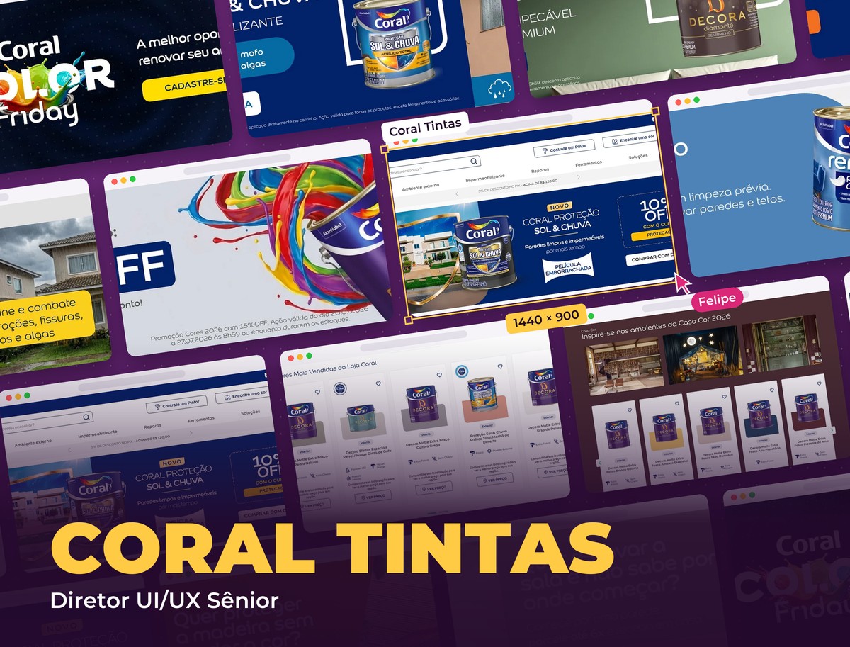 Retail & E-commerce
Coral Tintas
Creative direction and UI/UX for all campaign media
See project Edtech & Languages
Fluency Academy
Concept and creative direction of the "Intensive English" campaign
See project