Papelletos
Online store for custom stationery, with UI/UX and development on the Tray platform
- My role
- UX/UI Designer · Web Developer
 Papelletos
Context
Papelletos is a personalized stationery brand of planners, notebooks, devotionals and agendas. I worked freelance between 2021 and 2022: I did the UI/UX and development of the online store on the Tray platform, with a custom HTML and CSS theme, and designed the covers of the planner collections sold in the store.
- Client
- Papelletos
- Category
- E-commerce
- Roles
- UX/UI Designer, Web Developer
- Technology
- Tray, HTML, CSS
Challenge
People buy personalized stationery because they're charmed, but they only place the order if they trust the store. The challenge was to have a light, delicate storefront in the brand's tone that also immediately answered first-time buyers' doubts: delivery, installments, guarantee and support.
The store, section by section
From the brand banner to the footer, the path of someone who arrives, chooses and buys.
- 01 / 04
The top
Search, account, orders and cart in the header, the categories (agendas, notebooks, devotionals, planners, desk planner and "Crazy for Cats") with icons in the green menu and the banner with the brand lettering and the line "People who love stationery". Right below, four badges answer first-purchase doubts: secure delivery, installments, guarantee and WhatsApp support.
- 02 / 04
Transactions
A four-column showcase on white so the colorful covers stand out: product photo, name, rating, price with interest-free installments right below and the green "Buy" button on every card.
- 03 / 04
Highlights
A second showcase with the store's highlights (financial, devotional and study planners), in the same card pattern, so people scrolling keep finding products without opening a category.
- 04 / 04
Promotions, newsletter and footer
A black flash-sale bar to create urgency, access to customer reviews, the aqua newsletter and the footer with Instagram, social links, contact details, order tracking, institutional pages and a protected-store seal.
Planner collections
I also designed the covers of the collections sold in the store, with hand lettering and pastel tones that go together: each phrase comes in lime, pink, lilac, aqua and patterned versions.
Visual System
Aqua and beige with hand lettering: the store feels like an artisan stationery shop, and the pastel products stand out against the light background.
Palette
Papelletos Green
#4BA19A
Header, menu, buttons and footer
Aqua
#D9F2EB
Badges and newsletter background
Paper Beige
#EBDFD0
Banner background
Black
#111111
Brand lettering and promotions bar
White
#FFFFFF
Showcase and product cards
Takeaways
In a small store, trust sells as much as the product. Placing delivery, installments, guarantee and WhatsApp right below the banner answers doubts before they turn into abandonment, and creating the products themselves with the same identity keeps the whole store coherent.
Other projects to explore.
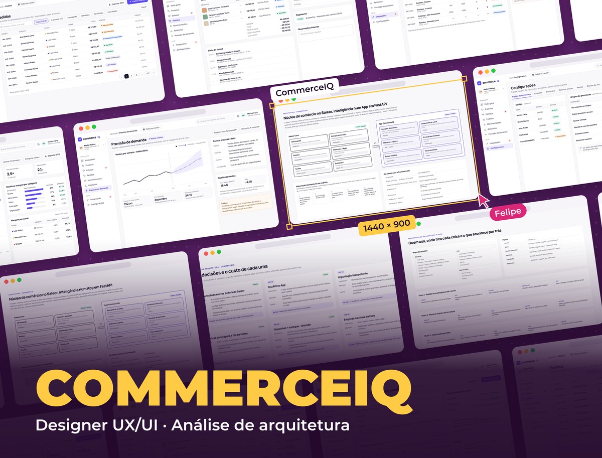 E-commerce · Python
CommerceIQ
E-commerce intelligence platform in Python: orders from every channel, stock per warehouse, stockout risk, real margin and demand forecasting
See project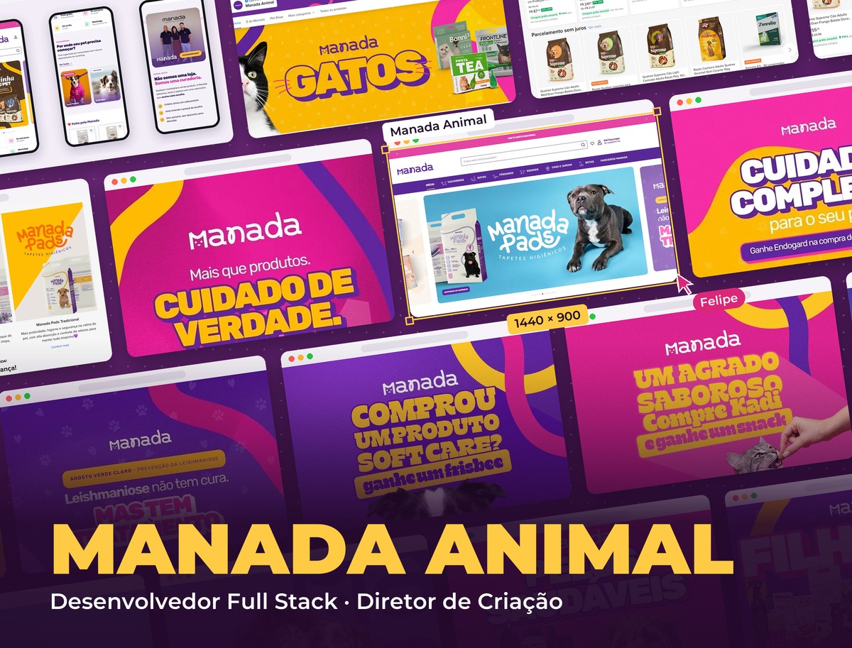 E-commerce & Pet
Manada Animal
Pet shop e-commerce and digital experience
See project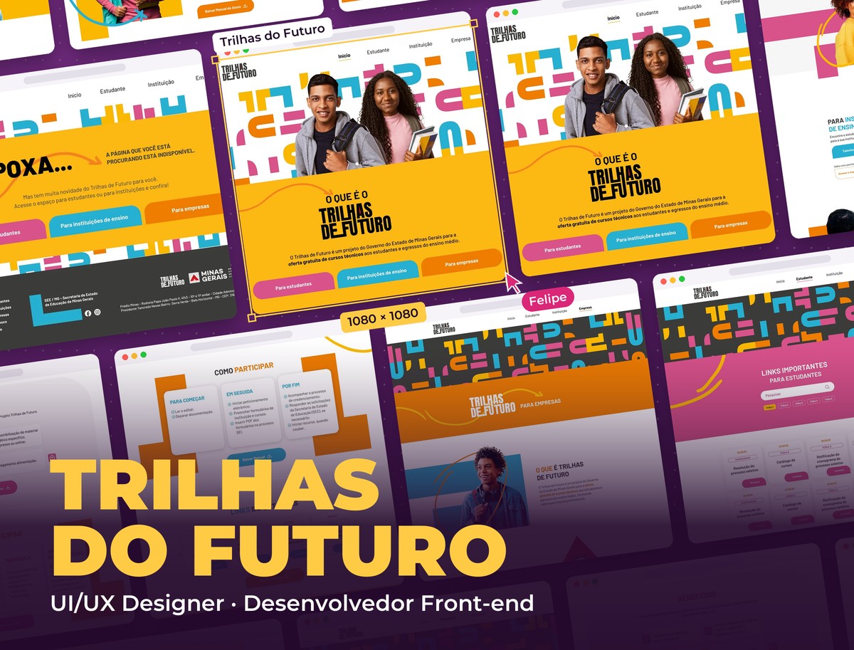 Education & Government
Trilhas do Futuro
Educational platform for the Minas Gerais State Government
See project